




The Brief
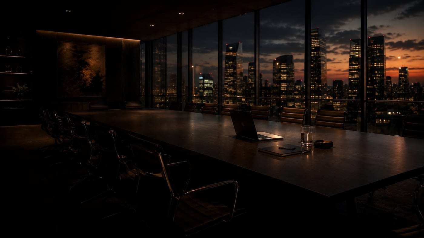
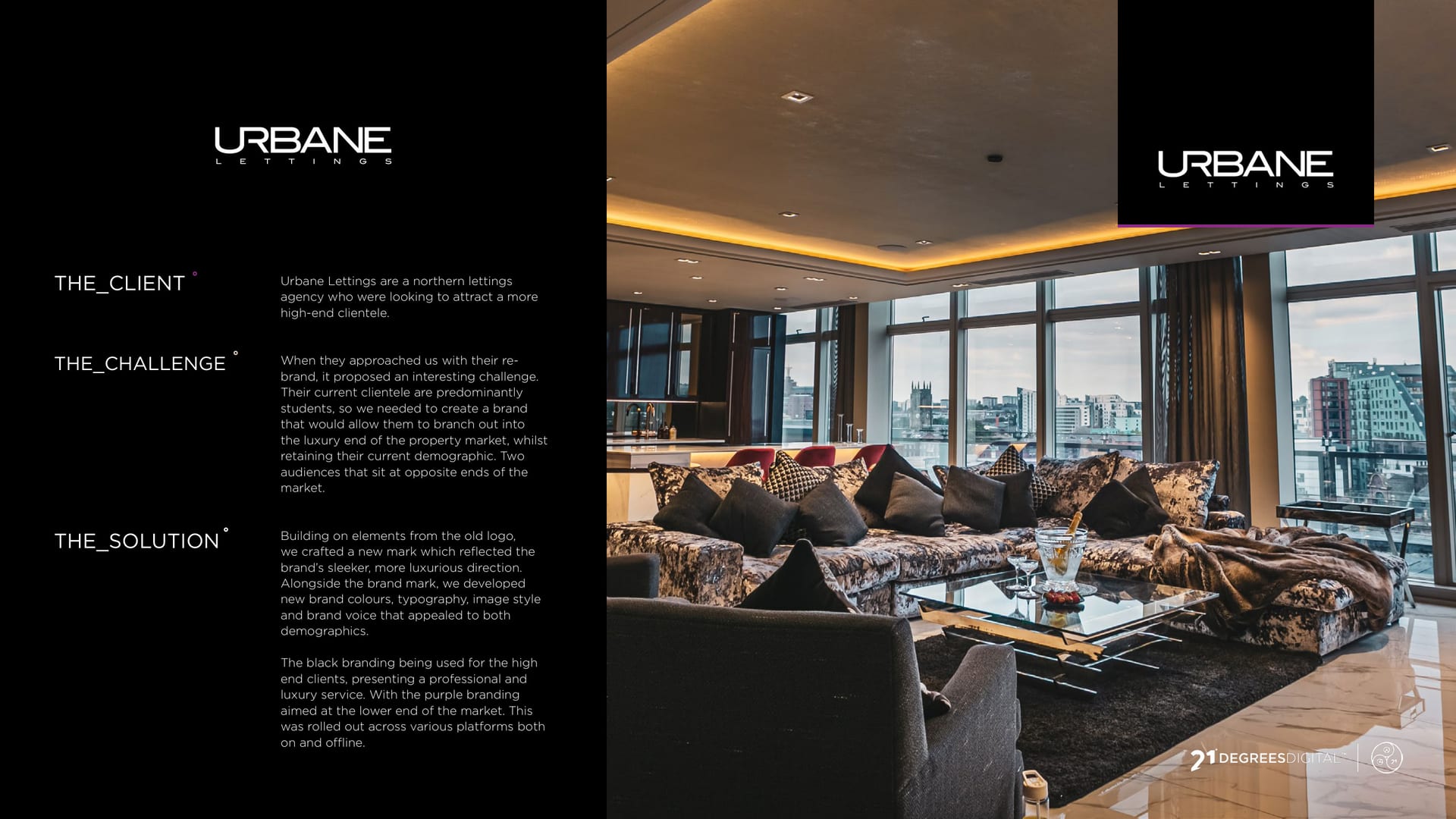
Urbane Lettings runs property in a market full of beige. They wanted an identity with a bit of swagger: premium enough for a penthouse, flexible enough for the everyday.
The Idea
The mark is a sharp chevron: a rooftop and an upward arrow in one. In black it reads exclusive. In full colour it reads friendly. Same shape, two personalities.
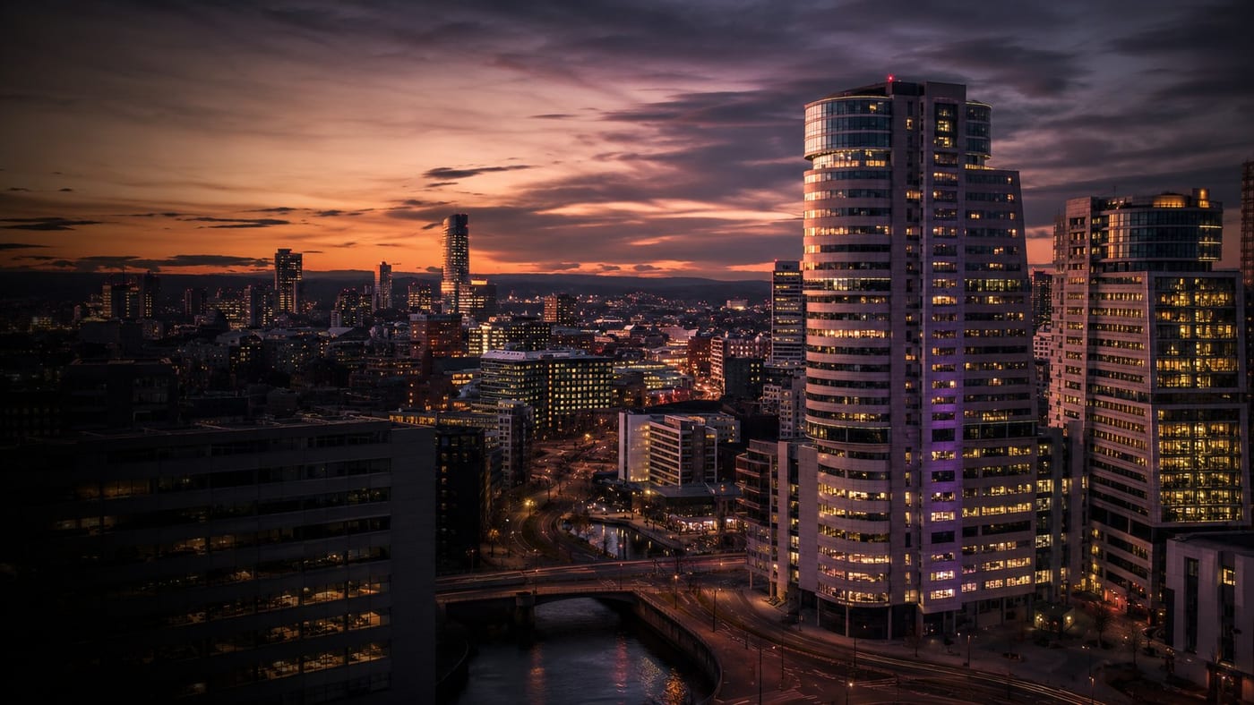
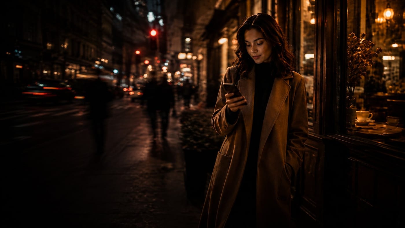
In the City
Then out it went: signage, stationery, a social feed with actual personality, and a billboard that made lettings look like a lifestyle.
Premium enough for a penthouse, flexible enough for the day-to-day.