



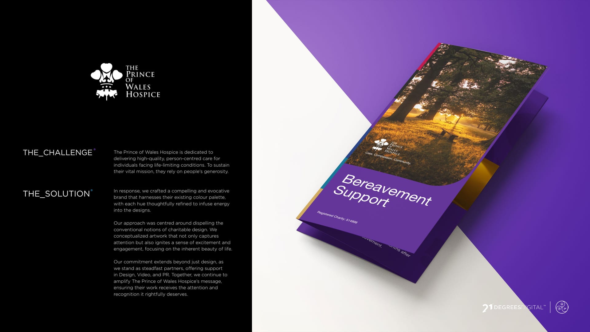
Prince of Wales Hospice bereavement support trifold, purple and autumn tones.
CASE STUDY · GRAPHIC DESIGN

The Prince of Wales Hospice, colour with care °

A hospice does profound work, and its fundraising should not look like an apology. We gave the campaigns a warm, vivid look that earns attention without losing the heart.

  • Graphic Design
  • Campaign Design
Client
The Prince of Wales Hospice
Service
Graphic Design
Sector
Charity & Public Sector
The Work

Fundraising worth looking at.

  • 4 campaign pieces: bereavement, in-memory, Mother’s Day and the Hospice Hero Challenge
  • 1 warm, vivid look across the lot
  • 0 shades of beige, on purpose

The Brief

The Prince of Wales Hospice does profound, tender work. Its fundraising materials needed to earn attention and hold their own on a busy noticeboard, without ever losing the warmth underneath.

Bereavement support, handled with care.

The Range

So we gave each campaign its own confident colour and kept the warmth constant. Purple, teal, pink and yellow, all clearly from the same family, none of them shy.

Giving in memory.
Mother’s Day tea.
Hospice Hero Challenge.
On the feed.

Fundraising that earns attention, and keeps the heart.

You might’ve seen us about

Fundraising that deserves better?

Warm, vivid and full of heart. Let us design your next campaign.