





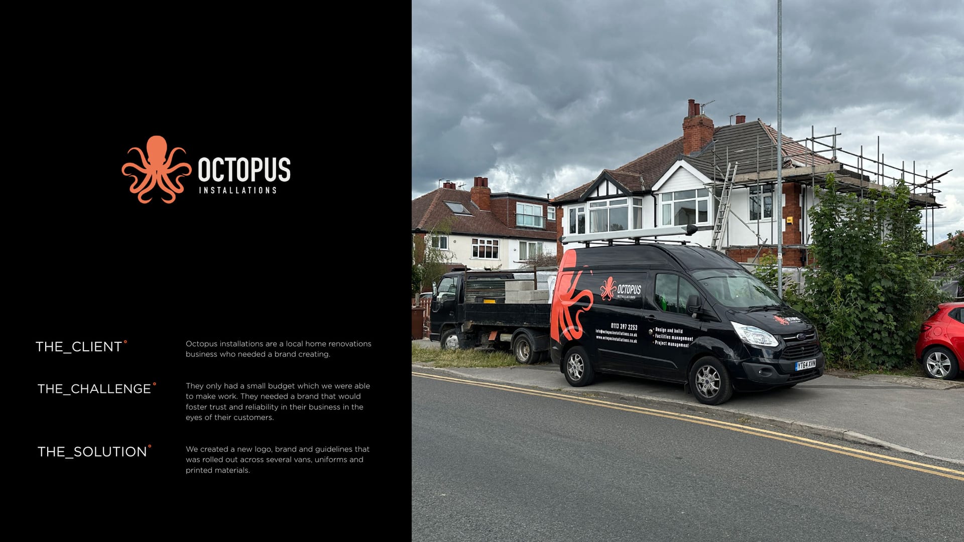
Octopus Installations branded van outside a house.
CASE STUDY · BRAND IDENTITY

Octopus Installations, all hands on deck °

A local installations firm that wanted a brand with a bit of grip. Friendly, memorable, and impossible to miss on the side of a van.

  • Brand Identity
  • Graphic Design
Client
Octopus Installations
Service
Graphic Design
Sector
Construction
The Work

A trades brand with real grip.

  • 3 touchpoints branded: van livery, brochure and stationery
  • 1 octopus mark you will not forget
  • 2 colours doing the work: orange and navy

The Brief

Octopus Installations does the hands-on work that keeps buildings standing and running. They wanted a brand with real personality, not another anonymous trades logo.

Hard to miss at thirty miles an hour.

The Idea

So we gave them an octopus. Eight arms, all hands on deck, in a warm orange against a confident navy. It sticks in the memory, which is rather the point.

In print.

All hands on deck.

You might’ve seen us about

Trades brand that needs personality?

Memorable, friendly and hard to miss. Let us build it.