







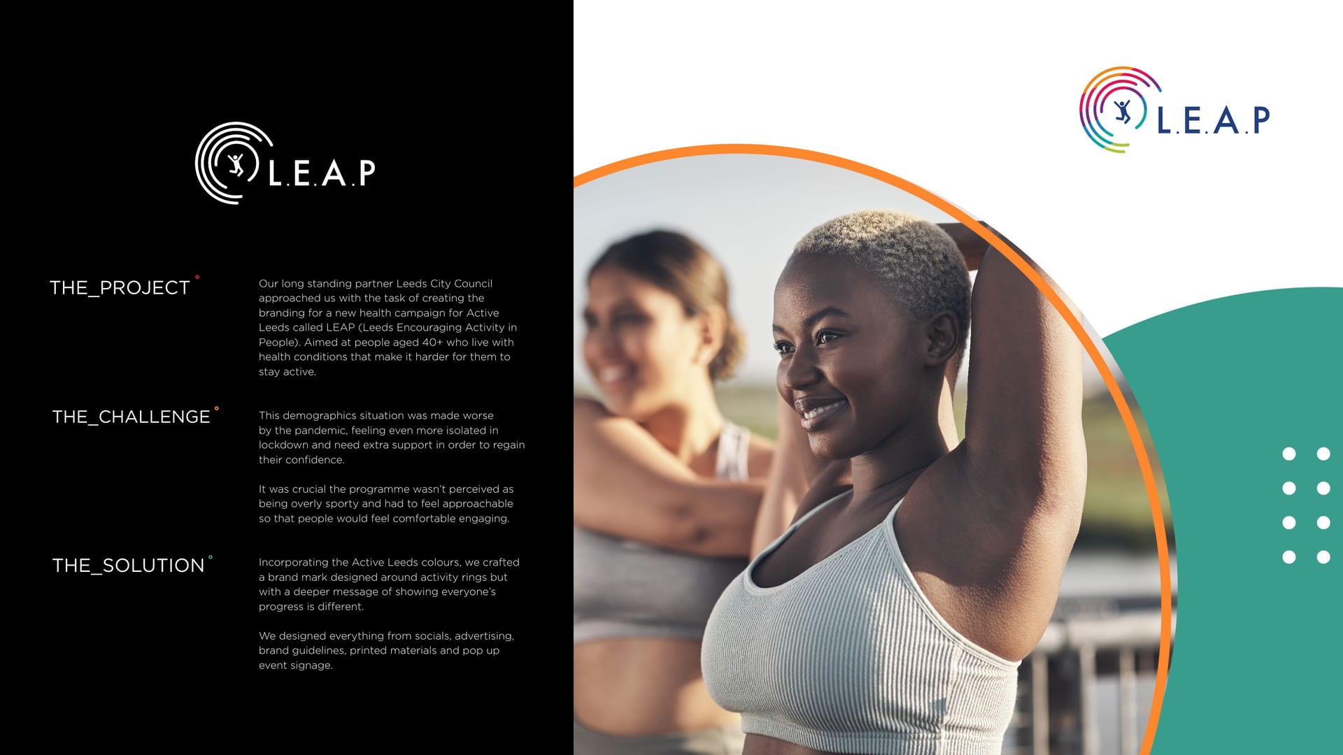
LEAP brand identity, colourful rings and an active lifestyle image.
CASE STUDY · BRAND IDENTITY

LEAP, small steps, big brand °

Leeds Encouraging Activity in People needed a brand as warm and welcoming as the programme. Bright, human, and a world away from clinical health messaging.

  • Brand Identity
  • Graphic Design
Client
LEAP, Active Leeds
Service
Graphic Design
Sector
Charity & Public Sector
The Work

Bright, human, never clinical.

  • 1 full brand system, guidelines and all
  • 5 touchpoints branded: brochure, out-of-home, app, workwear and social
  • 3 partners aligned: LEAP, Active Leeds and the NHS

The Brief

LEAP, Leeds Encouraging Activity in People, helps people get moving in a way that actually fits their lives. Small steps are better than no steps, as the campaign puts it.

The brand needed to feel warm, encouraging and human. The opposite of a stern health leaflet, and welcoming to everyone.

Find your confidence.

The Idea

We built a full-spectrum system: bright rings, friendly Futura type, and a palette that covers everyone rather than picking a lane. It looks like movement, and it looks like it means it.

  • Magenta #d9008a
  • Teal #2c9fa3
  • Orange #f47b20
  • Coral #feb28d
  • Navy #1b3a5c

A slice of LEAP's full-spectrum palette, built to include everyone.

You might’ve seen us about

Programme that needs a warmer brand?

Bright, human and welcoming. Let us build it.