





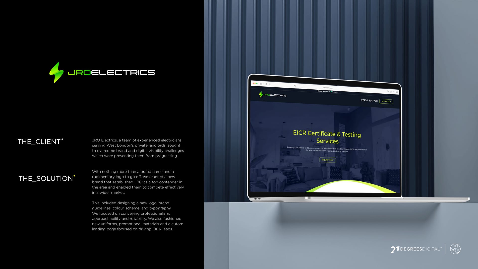
JRO Electrics website on a laptop, electric-green branding on charcoal.
CASE STUDY · BRAND IDENTITY

JRO Electrics, a brand with a bit of a spark °

A trades brand that needed to look as reliable as the work. Sharp, professional, and impossible to mistake for the other van on the street.

  • Brand Identity
  • Web Design
  • Graphic Design
Client
JRO Electrics
Service
Graphic Design, Web Design
Sector
Construction
The Work

Reliable work, reliable brand.

  • 4 touchpoints branded: website, brochure, flyer and workwear
  • 1 identity built around a lightning bolt
  • 2 colours doing the work: electric green and charcoal

The Brief

JRO Electrics does the serious, safety-critical stuff: testing, certificates, making sure a house will not try to kill you. The brand needed to look every bit as dependable.

The brief was sharp and professional, with enough personality to stand out in a sea of identical trades vans.

The brand, front to back.

The Idea

We built it around a bold lightning bolt, an electric green, and a confident charcoal. Instantly readable at a glance, whether it is a website or the back of a T-shirt.


You might’ve seen us about

Trades brand that needs to stand out?

Look as reliable as the work. Let us build your brand.