




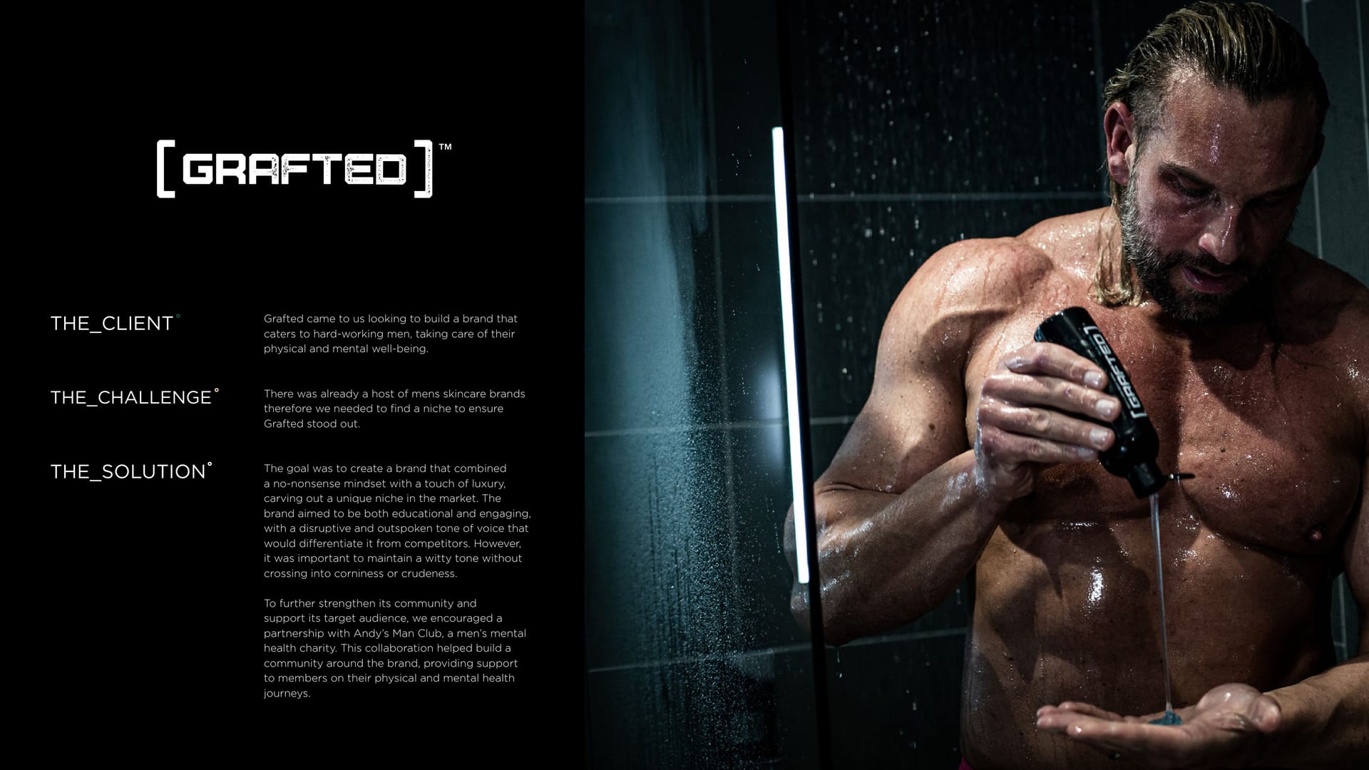
Grafted grooming brand, black packaging held in a hand, moody lighting.
CASE STUDY · BRAND IDENTITY

Grafted, working products for working men °

No-nonsense grooming for men who graft. The brief was a brand as blunt as the product: premium, masculine and completely unbothered about fitting in on a pretty shelf.

  • Brand Identity
  • Packaging
  • Graphic Design
Client
Grafted
Service
Graphic Design
Sector
eCommerce
The Work

Hero products, hero brand.

  • 4 touchpoints branded: packaging, subscription box, store and app
  • 1 no-nonsense monochrome identity
  • 0 milk, science or bull, per the label

The Brief

Grafted makes grooming for men who graft. Working products for working men, as they put it, with a straight face and zero interest in fluff.

They wanted a brand as direct as the product. Premium, masculine, and quite happy to look like kit rather than cosmetics.

Welcome to the club.

The Idea

We went hard monochrome. Black, white, and a wordmark that looks stamped rather than styled. It reads like something you keep in a gym bag, not a bathroom cabinet.

Used, Not Shelved

Then we rolled it across the lot: packaging, the store, the app, and a shoot that looks like the products actually get used.

For the graft.
For after.

Hero working products for hero working men.

You might’ve seen us about

Want a brand that pulls no punches?

If your product is honest, your brand should be too. Let us talk.