



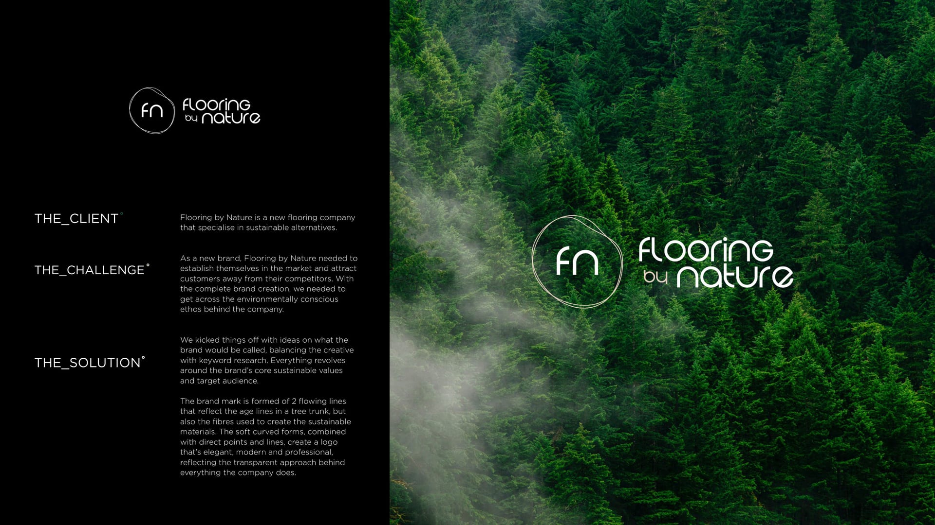
Flooring by Nature brand mark over a misty forest, sage and cream identity.
CASE STUDY · BRAND IDENTITY

Flooring by Nature, grounded in the good stuff °

A natural-flooring brand that needed to feel as calm and considered as the product. So we kept it earthy, kept it premium, and let the materials do the talking.

  • Brand Identity
  • Graphic Design
Client
Flooring by Nature
Service
Graphic Design
Sector
Home & Lifestyle
The Work

One calm system, two natural brands.

  • 2 sub-brands under one identity: Flooring by Nature and Wool
  • 4 touchpoints branded: brochure, cards, social and site
  • 3 natural materials it is built around: wood, cork and wool

The Brief

Flooring by Nature makes flooring from the good stuff: wood, cork and wool. The kind of thing you want underfoot and feel slightly smug about. The brand needed to feel the same way: natural, premium and quietly confident.

There was a second brand in the mix too, Wool, so the system had to stretch across both without losing the thread.

Nature, front and centre.

The Brand

We built the identity around soft sage, warm cream and the texture of the materials themselves. Nothing shouty. Just a calm, grown-up look that lets a beautiful floor be the hero.

  • Sage #3a493c
  • Cork #95664b
  • Oak #7f6748
  • Bone #cacac2

Sage, cork and oak, the whole brand in a handful of natural tones.

Across the Range

From the brochure to the business cards to the social feed, the same calm runs through it. Two brands, one considered system, no loose ends.

In print.
On the feed.

A breath of fresh air.

You might’ve seen us about

Want a brand that feels as good as it looks?

If your product is premium, your brand should be too. Let us talk.