
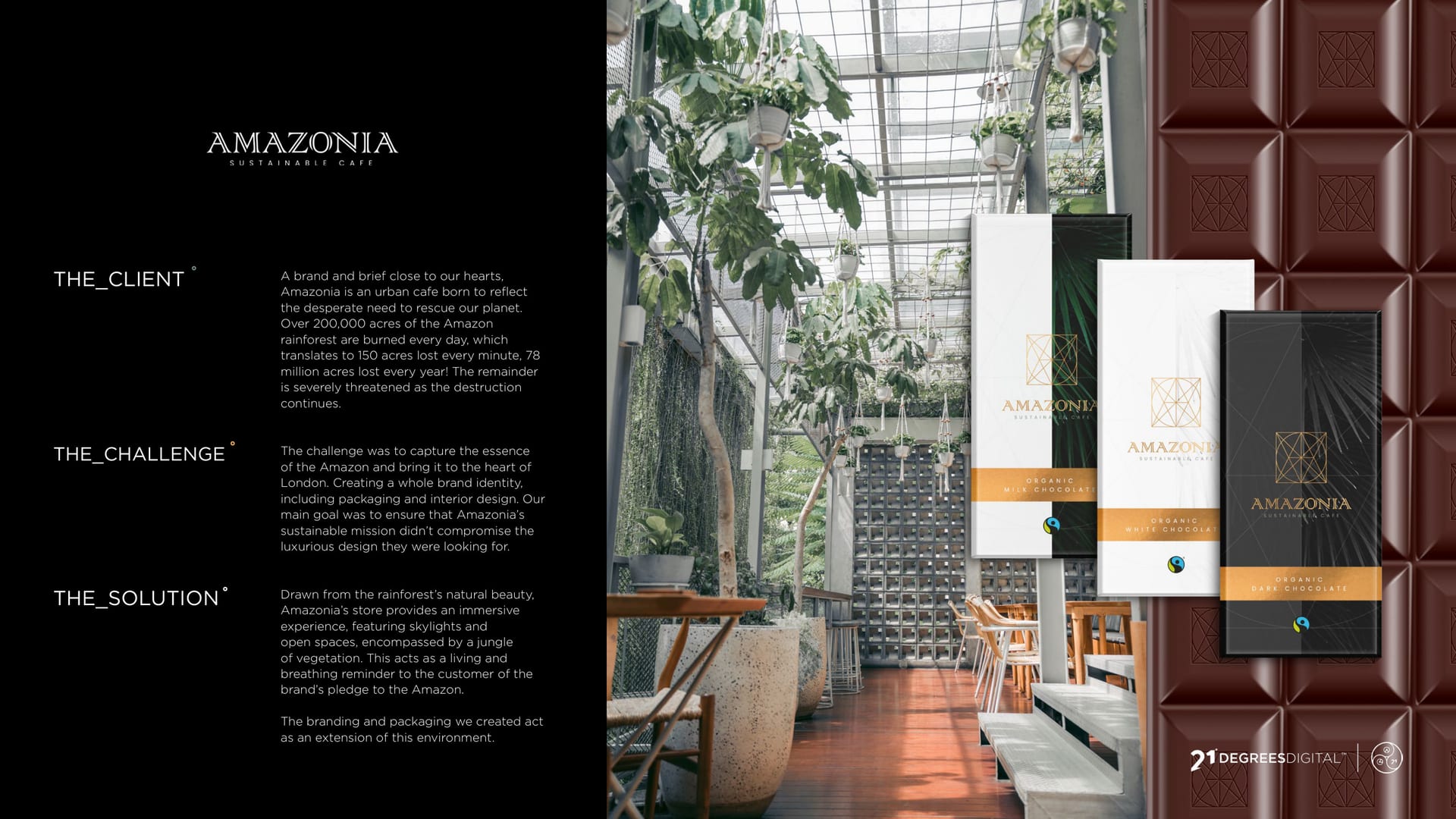
Amazonia sustainable cafe, a lush green interior with the gold brand mark.
CASE STUDY · BRAND IDENTITY

Amazonia, a little jungle luxury °

A sustainable cafe that feels like stepping into a greenhouse. The brand needed to be lush, premium and unmistakably green, across everything from a coffee cup to a chocolate bar.

  • Brand Identity
  • Packaging
  • Graphic Design
Client
Amazonia
Service
Graphic Design
Sector
Hospitality
The Work

Sustainable cafe, seriously stylish.

  • 3 in the chocolate range: milk, white and dark
  • 4 packaging formats branded: bars, cups, boxes and wraps
  • 1 green-and-gold identity across the lot

The Brief

Amazonia is a sustainable cafe that feels like stepping into a greenhouse. The brand needed to be lush, premium and unmistakably green, and to hold together across a whole menu of packaging.

A little jungle, indoors.

The Idea

We built the identity on deep jungle green and a warm gold, with a fine geometric mark and plenty of foliage. It feels natural and premium at the same time, which is exactly the point.

  • Jungle #283128
  • Gold #a8895a
  • Cream #eff0ef
  • Plum #38132b

Deep jungle green and warm gold, grown-up and lush.

The Range

Right down to the chocolate: one system, three bars, all clearly from the same jungle.

Milk.
White.
Dark.

Life is short, enjoy your coffee.

You might’ve seen us about

Hospitality brand that needs to feel premium?

Lush, considered and unmistakable. Let us build it.