







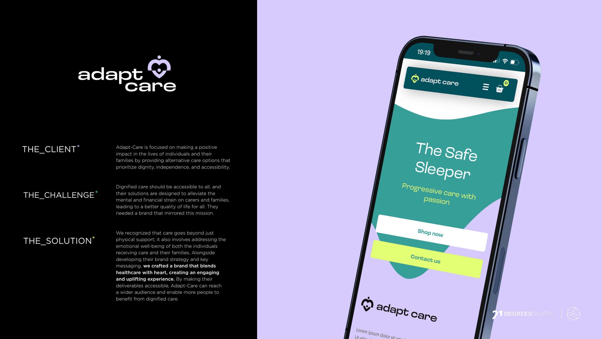
Adapt-Care brand, The Safe Sleeper app on a lilac background.
CASE STUDY · BRAND IDENTITY

Adapt-Care, progressive care with passion °

A care brand with a genuinely good heart and a product to match. It needed an identity that felt warm and human, without tipping into clinical or cutesy.

  • Brand Identity
  • Graphic Design
Client
Adapt-Care
Service
Graphic Design
Sector
Healthcare
The Work

Warm, human, never clinical.

  • 4 touchpoints branded: app, website, out-of-home and social
  • 2 signature colours doing the work: teal and lilac
  • 1 brand guideline system to keep it consistent

The Brief

Adapt-Care is a care brand with its heart in the right place, and a product, the Safe Sleeper, built to help people sleep more and stress less.

The brief was an identity that felt genuinely warm and human. Reassuring, not clinical. Kind, not cutesy.

More sleep, less stress.

The Idea

We built the identity on a calm teal and a soft lilac, with rounded, friendly type and plenty of breathing room. It feels like a brand that has your back.

  • Teal #33a198
  • Lilac #d7cbfd
  • Deep Teal #316877
  • Mint #eff5d9

Calm teal, soft lilac, room to breathe.

You might’ve seen us about

Care brand that needs a heart?

Warm, human and never clinical. Let us build yours.